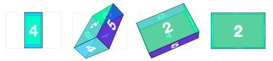
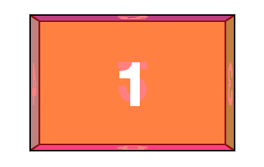
Rectangular prism
Cube objects are easy enough to generate as we only have to worry about one measurement. But how would we handle a non-regular rectangular prism? Let’s try to make one 300px wide, 200px high, and 100px deep.
The markup remains the same as the #cube’s version, but switch the #cube id for #box. The container styles remain mostly the same.
.container {
  width: 300px;
  height: 200px;
  position: relative;
  -webkit-perspective: 1000;
}

#box {
  width: 100%;
  height: 100%;
  position: absolute;
  -webkit-transform-style: preserve-3d;
}
Now, to position the faces. Each set of faces will need their own sizes. The smaller faces (left, right, top and bottom) need to be positioned in the center of the container, where they can be easily rotated and then shifted outward. The thinner left and right faces get positioned left: 100px ( (300 - 100) / 2 ), The stouter top and bottom faces get positioned top: 50px ( (200 - 100) / 2 ).
#box figure {
  display: block;
  position: absolute;
  border: 2px solid black;
}

#box .front,
#box .back {
  width: 296px;
  height: 196px;
}

#box .right,
#box .left {
  width: 96px;
  height: 196px;
  left: 100px;
}

#box .top,
#box .bottom {
  width: 296px;
  height: 96px;
  top: 50px;
}
The rotate values all can remain the same as in the cube example, but for this rectangular prism, the translate values do differ. The front and back faces each are shifted out 50px since the #box is 100px deep. Left and right faces translate is 150px for 300px width. Top and bottom panels go 100px for the 200px height.
#box .front  { -webkit-transform: rotateY(   0deg ) translateZ(  50px ); }
#box .back   { -webkit-transform: rotateX( 180deg ) translateZ(  50px ); }
#box .right  { -webkit-transform: rotateY(  90deg ) translateZ( 150px ); }
#box .left   { -webkit-transform: rotateY( -90deg ) translateZ( 150px ); }
#box .top    { -webkit-transform: rotateX(  90deg ) translateZ( 100px ); }
#box .bottom { -webkit-transform: rotateX( -90deg ) translateZ( 100px ); }
Just like the cube example, to expose a face, the #box needs to have a style to reverse its face’s transform. Both the translateZ and rotate values are the opposites of the corresponding face.
#box.show-front  { -webkit-transform: translateZ(  -50px ) rotateY(    0deg ); }
#box.show-back   { -webkit-transform: translateZ(  -50px ) rotateX( -180deg ); }
#box.show-right  { -webkit-transform: translateZ( -150px ) rotateY(  -90deg ); }
#box.show-left   { -webkit-transform: translateZ( -150px ) rotateY(   90deg ); }
#box.show-top    { -webkit-transform: translateZ( -100px ) rotateX(  -90deg ); }
#box.show-bottom { -webkit-transform: translateZ( -100px ) rotateX(   90deg ); }