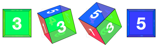
Cube
Creating 3D card objects is a good way to get started with 3D transform. But once you’ve mastered them, you’ll be hungry to push it further and create some true 3D objects: prisms. We’ll start out by making a cube.
The markup for the cube is similar to the card. This time we need 6 child elements for all 6 faces of the cube.
<section class="container">
<div id="cube">
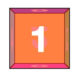
<figure class="front">1</figure>
<figure class="back">2</figure>
<figure class="right">3</figure>
<figure class="left">4</figure>
<figure class="top">5</figure>
<figure class="bottom">6</figure>
</div>
</section>
Basic position and size styles set the 6 faces on top of one another in the container.
.container {
  width: 200px;
  height: 200px;
  position: relative;
  -webkit-perspective: 1000;
}

#cube {
  width: 100%;
  height: 100%;
  position: absolute;
  -webkit-transform-style: preserve-3d;
}

#cube figure {
  width: 196px;
  height: 196px;
  display: block;
  position: absolute;
  border: 2px solid black;
}
With the card, we only had to rotate its back face. The cube, however, requires that 5 of the 6 faces to be rotated. Faces 1 and 2 will be the front and back. Faces 3 and 4 will be the sides. Faces 5 and 6 will be the top and bottom.
#cube .front  { -webkit-transform: rotateY(   0deg ); }
#cube .back   { -webkit-transform: rotateX( 180deg ); }
#cube .right  { -webkit-transform: rotateY(  90deg ); }
#cube .left   { -webkit-transform: rotateY( -90deg ); }
#cube .top    { -webkit-transform: rotateX(  90deg ); }
#cube .bottom { -webkit-transform: rotateX( -90deg ); }
We could remove the #cube .front style declaration, as this transform has no effect, but let’s leave it in to keep our code consistent.
Now each face is rotated, and only the front face is visible. The 4 side faces are all perpendicular to the viewer, so they appear invisible. To push them out to their appropriate sides, they need to be translated out from the center of their positions. Each side of the cube is 200px wide. From the cube’s center they’ll need to be translated out half that distance, 100px.
#cube .front  { -webkit-transform: rotateY(   0deg ) translateZ( 100px ); }
#cube .back   { -webkit-transform: rotateX( 180deg ) translateZ( 100px ); }
#cube .right  { -webkit-transform: rotateY(  90deg ) translateZ( 100px ); }
#cube .left   { -webkit-transform: rotateY( -90deg ) translateZ( 100px ); }
#cube .top    { -webkit-transform: rotateX(  90deg ) translateZ( 100px ); }
#cube .bottom { -webkit-transform: rotateX( -90deg ) translateZ( 100px ); }
Note here that the translateZ function comes after the rotate. The order of transform functions is important. Take a moment and soak this in. Each face is first rotated towards its position, then translated outward in a separate vector.
We have a working cube, but we’re not done yet.
Returning to the Z origin plane
For the sake of our users, our 3D transforms should not distort the interface when the active panel is at its resting position. But once we start pushing elements out of the Z origin plane, distortion is inevitable.
In order to keep 3D transforms snappy, Safari composites the element then applies the transform. Consequently, anti-aliasing on text will remain whatever it was before the transform was applied. When transformed forward in 3D space, significant pixelation can occur.
Looking at back at the “Perspective 3 demo”:../examples/perspective-03.html, note that no matter how small the perspective value is, or where ever the transform origin may be, the 1 panel always returns to its original position, as if all those funky 3D transforms didn’t even matter.
To resolve the distortion and restore pixel perfection on our #cube, we can push back the 3D object, so that the front face will be positioned back at the Z origin.
#cube { -webkit-transform: translateZ( -100px ); }
To expose any face of the cube, we’ll need a style that rotates the cube to expose any face. The transform is the opposite of the corresponding face. We toggle the necessary class on the #box to apply the appropriate transform.
#cube.show-front  { -webkit-transform: translateZ( -100px ) rotateY(    0deg ); }
#cube.show-back   { -webkit-transform: translateZ( -100px ) rotateX( -180deg ); }
#cube.show-right  { -webkit-transform: translateZ( -100px ) rotateY(  -90deg ); }
#cube.show-left   { -webkit-transform: translateZ( -100px ) rotateY(   90deg ); }
#cube.show-top    { -webkit-transform: translateZ( -100px ) rotateX(  -90deg ); }
#cube.show-bottom { -webkit-transform: translateZ( -100px ) rotateX(   90deg ); }
Notice how the order of the transform functions has reversed. First we push the object back with translateZ, then we rotate it.
Finishing up, we can add a transition to animate the rotation between states.
#cube { -webkit-transition: -webkit-transform 1s; }