Perspective
To activate 3D space, an element needs perspective. This can be applied in two ways: using the transform property, with the perspective as a functional notation.
-webkit-transform: perspective( 600 );
or using the perspective property:
-webkit-perspective: 600;
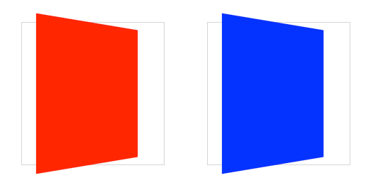
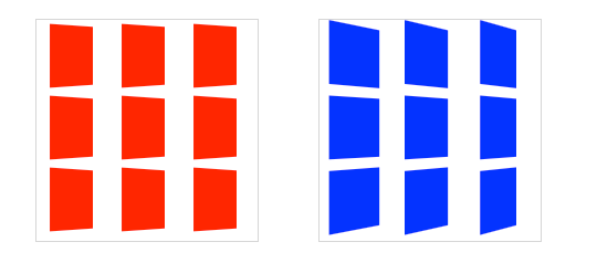
These two formats both trigger a 3D space, but there is a difference. The functional notation is convenient for directly applying a 3D transform on a single element (in the previous example, I use it in conjunction with a rotateX transform). But when used on multiple elements, the transformed elements don’t line up as expected. If you use the same transform across elements with different positions, each element will have its own vanishing point. To remedy this, use the perspective property on a parent element, so each child may share the same 3D space.
The value of perspective determines the intensity of the 3D effect. Think of it as a distance from the viewer to the object. The greater the value, the further the distance, the less intense the visual effect. perspective: 2000; yields a subtle 3D effect, as if we are viewing an object from far away through binoculars. perspective: 100; produces a tremendous 3D effect, like a tiny insect viewing a massive object.
By default, the vanishing point for a 3D space is positioned at the center. You can change the position of the vanishing point with perspective-origin property.
-webkit-perspective-origin: 25% 75%;